

The assignment was to make an artist's trading card in the Tim Holtz style, using at least one Tim Holtz product.
I decided to use the technique Tim has made popular of "distressing" the paper for the background. I thought I'd take some pix as I went to inspire you to try this technique if you haven't already. It's simple to do and fun. :)
I started with an ATC-sized piece of file folder, like so:

You then crumple the hell out of it, showing it who's boss. Go ahead--break down the fibers. Open it up and crumple it a different way. Crumple it all to hell. Teach it a lesson:
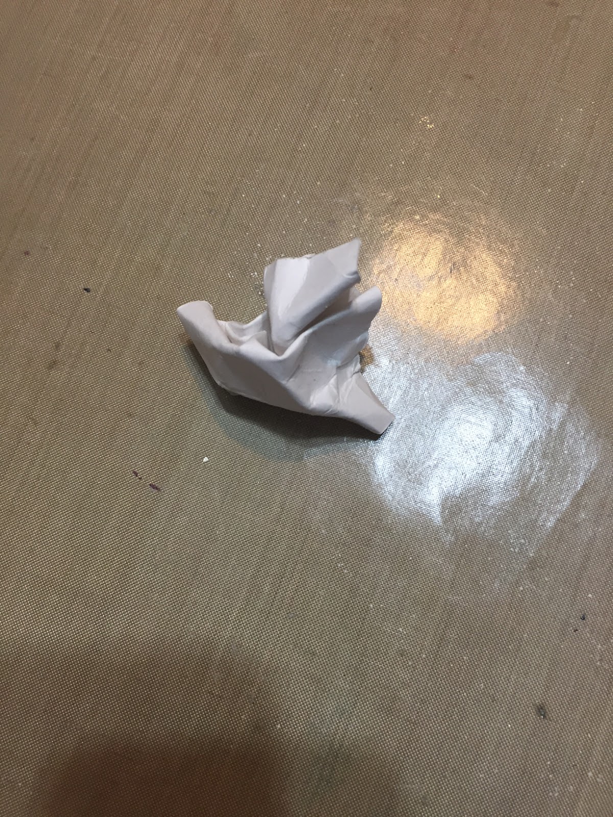
When you have humiliated that poor card enough and your adrenaline surge begins to dissipate, caress it gently and lovingly back open, and take a Distress ink pad in a brown color and stroke the raised areas of the crumples with color. (Note: It must be Distress ink and not another type--this ink is highly reactive with water, and you want the color to feather out in the next step.)


Here;s what mine looked like (above) after the first pass with Walnut Stain. It was a little stark for the effect I was after, so I re-crumpled and gave the card a few swipes with a pad of Tea Dye:

Now we were getting somewhere! The next step is to get out a spray bottle of water and spritz your card thoroughly to activate the ink and get it wicking out into the paper fibers:

Well, I let this marinate a few minutes and didn't get the degree of wicking that I wanted--perhaps it was the finish of the file folder cardstock base--so I decided to help things along with a spritzing of Tea Dye Distress Ink Spray. The card started to take more color immediately...

...so I patted it dry with a paper towel before it got too dark, and found that it looked like this:

This was cool and all, and I liked how the color had seeped into the places where the fibers had been broken down (that is why you really need to mistreat your card base at the beginning!)...but the overall effect wasn't quite what I'd hoped for.
However! Did you know that your card also has...a BACK side???
Oh yes! Here's what the card looked like flipped over.

To me this was much more interesting. There was more variation in the color value, and I loved how the Walnut Stain ink had pulled a little green as it bled onto the back side of the card. Yup. I was going with this.
I dried it with my heat tool, then pressed it with an iron for good measure. At this point, the card was toasty dry and looked like this:

Isn't that beautiful? There are raised areas along the folds that look like veins, and some of the lines look like what you'd see in palmistry. This technique is so cool! Sometimes I get so enamored of the backgrounds that I am loth to proceed and put stuff on them. :( And yet...I girded my loins and pressed on.
Since this card was mainly about the background, I wanted to let that be the star, and decided to keep the composition down to simple imagery composed of two rubber stamps. The eye stamp is by the legendary Leavenworth Jackson (of whom I have been a fan lo this quarter century, when I first came under her spell), and the text is one of Tim Holtz's clear cling stamps.

I inked up the Leavenworth eye in Black Soot Distress Ink, and put two colors on the text stamp
--Walnut Stain touched by dabs of Black Soot--just to give some more interest and grunginess to the card.
At this point I really thought the card background looked and felt almost like leather (do you see those white raised veins? Do you?? Go ahead, click on the above photo to get a good look), and felt a pang of regret as I forced myself on to the next step--edging the card so the borders of it look as aged as the rest.

Out came the Tea Dye again, and I went around the edges with a mini ink tool, just to slightly build up an aged appearance. The result is subtle, but it's the little things, you know?

To add some more depth to the "aging," out came some yummy chalk ink in a deeper shade of brown, which I feathered around the edges using the direct-to-paper technique, not going in quite as far as I had done with the mini ink tool.

I like to keep it irregular, for more fake authenticity. Comme ça:
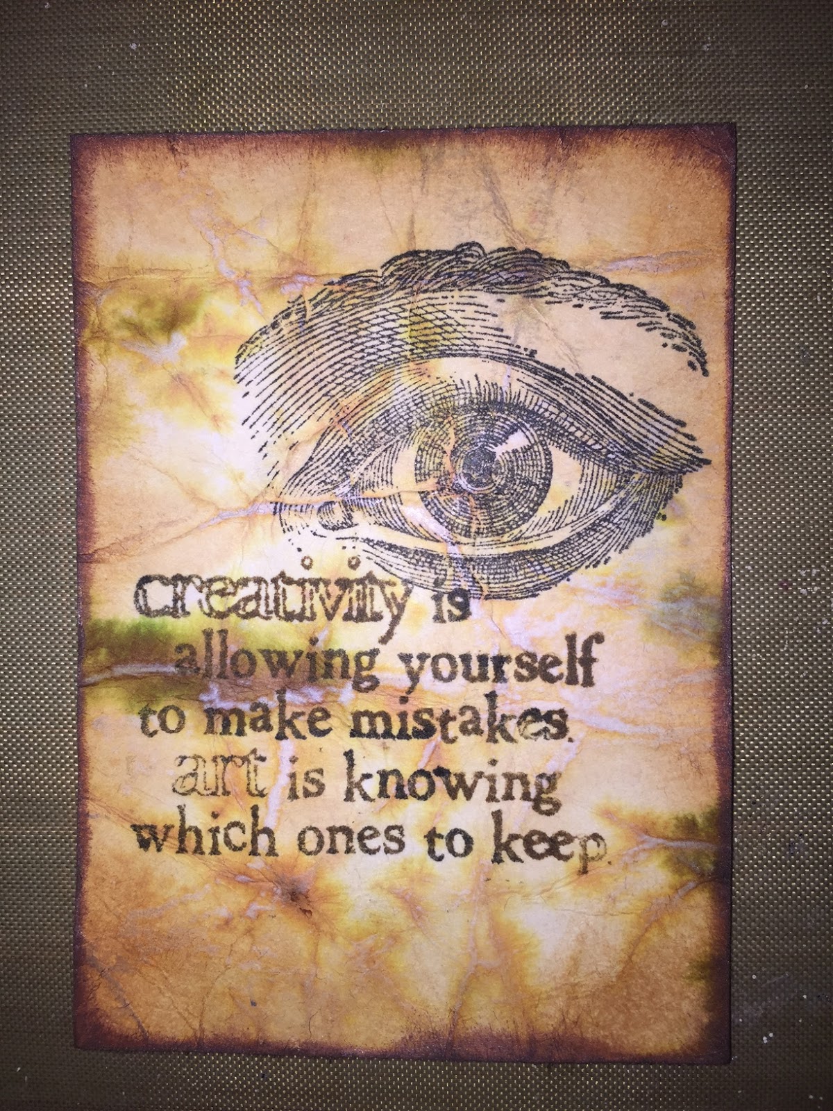
To finish the edging process, I added a thin line of black chalk ink just to frame the whole composition and echo the black ink of the eye. Then it looked like this (OMG I love those veins!), and was almost done.

To finish the card, I decided to add a little more Distress Ink at the edges to take away some of the symmetry of the background. Then I took a teeny tiny skinny silver gel pen and sketched in (not too precisely) a little silver shimmer inside the words "creativity" and "art" to help them stand out from the fascinating background just a bit, and so that the glimmer would just catch the eye as the card was handled.
And here is the final result! Once I knew I was using the back side of the card I had prepared, I also knew I was choosing this quote for the card. Apropos, no?

So tell me...have you ever tried this technique? How did you like the results? If you never have tried it, please keep it in mind. Seriously, it probably took you longer to read this blog post than it would to make this card. And this technique adds so much interest and a feel of "quality" to the result. I wish you could hold it in your hand yourself and see what I mean!
Ciao for now. ;)

No comments:
Post a Comment