Looking for something? Search this blog:

Showing posts with label resist. Show all posts

Saturday, January 14, 2017

'It's Snowing,' Said the Gryphon: Alice In Winterland


It's Alice in Winterland over at the Lost Coast Portal to Creativity! What is that, you ask? It's an art challenge where you enter a piece that uses at least one rubber stamp (from any company) in order to be entered to win a gift certificate for MOAR RUBBER from the fabulous Lost Coast Designs! More details about the challenge are here.

To offer a little visual inspiration on the theme of Alice being in Winterland, I have here this little fantasy project for you:


First I stamped the "Alice and Gryphon" image from the Alice, Dodo, and Griffen set from Lost Coast Designs, then masked it off and stamped the Chessboard from the Chess Set under it. Then I made a mask for the chessboard and added it to the card.

Next I took some snowflakes from the Small Snowflake Set and stamped them in resist ink, which I dried with a heat gun. Then I broke out the Distress inks and chose three shades of blue to start working into the card with a mini ink blending tool. Below you can see the first snowflake start to emerge from the "sky"...


...And here I'm adding the second shade of blue to bring out the next snowflake from the resist. You see that I am inking right on top of the masks I made to cover the central images.


At this point, with the masks still on, I broke out some ink sprays and added blue and silver shimmer to the card. Alas, the shimmer really does not photograph, but it gave a nice frosty look to the piece in real life. I left a little "halo" of uncolored paper around one of the snowflakes for a bit of light effect.
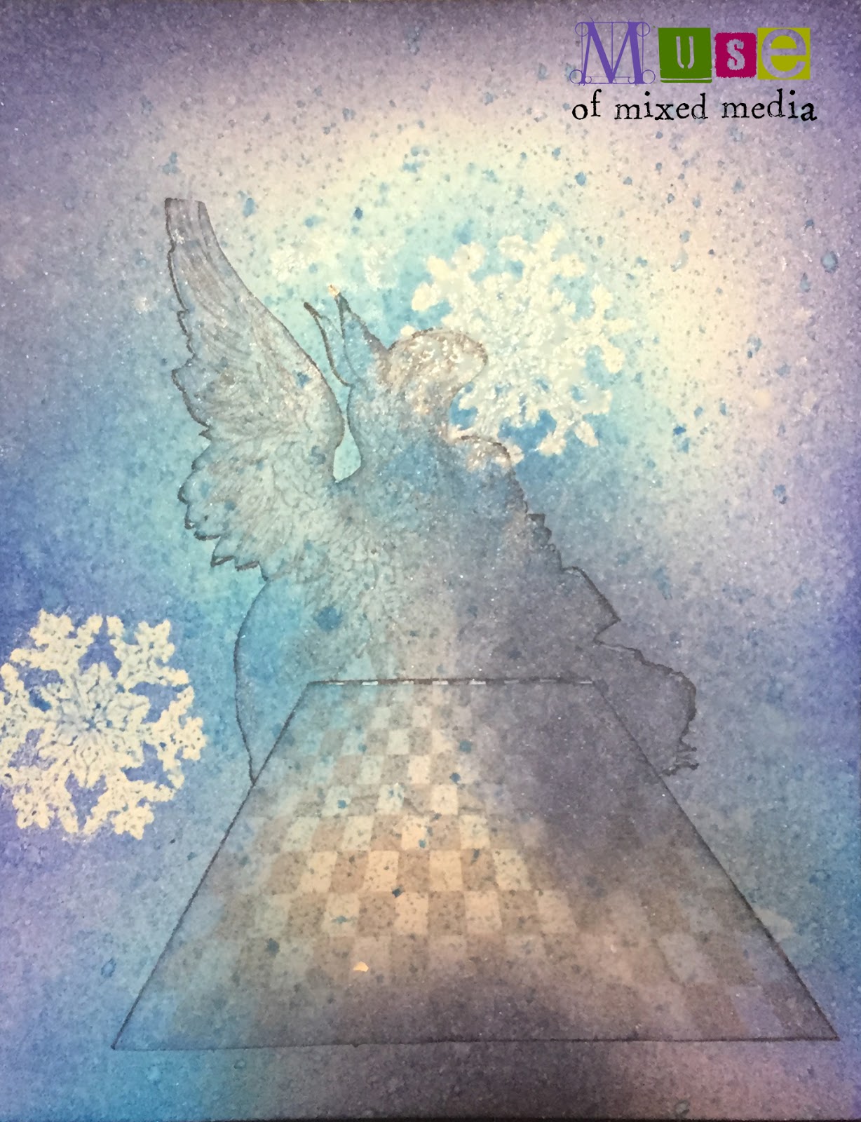

With white and silver gel pens, I added some background dots and tiny snowflakes. I also stamped a few more snowflakes with the Snowflake Set and embossed them with glittery white embossing powder. (The glitter doesn't show up very well here either...you can see it mostly on the snowflake at the lower right.) Then I was ready to remove the masks to let the figures stand out from the wintry background...


Here is the piece with the masks removed, photographed at another angle, attempting to show more of the glitter and shimmer:


Lastly, in InDesign I composed a sentiment (taken very nearly as a quote from Alice in Wonderland!) and inserted it into a frame. I printed this out and mounted the art atop it. Et voila!

Can't wait to see what you make for the Alice in Winterland challenge! You have until midnight on January 31 to enter.  :)


Friday, October 21, 2016

Halloween BASH Party Invitation: Iron-Off Embossing Powder Resist Technique

Ghoulish greetings, art-pals, as we continue to celebrate the 31 Days of Halloween blog hop over at Lost Coast Designs!

Today my contribution to the festivities is this Halloween Bash party invitation, featuring several of LCD's bizarre and beloved character images, all tricked out for a wicked and weird party.


This piece features LCD's new gears background stamp, perfect for industrializing and steampunking up all your projects that need a little metallic edge. 

To start, I stamped it twice on a 9" x 12" sheet of white Arches Hot Press watercolor paper, and embossed it with white embossing powder to make a resist. Here's what that phase looked like--can you see?


Next, I wanted to play with the fabulous Nuance pigment powders by Magenta, which I sprinkled on randomly in shades of orange and gold. These dry powders blossom and explode delightfully when you spray them with water, making surprising and beautiful background effects. Here's what they look like dry:


...And after the first spritzing, here's what my page looked like.


I did want more color, so on went some purple powder, and I kept spritzing...


There! Now my background was mostly colored in. I left some drier, barely-spritzed texture at the bottom for interest.


Now that the embossing powder resist had served its purpose, I wanted to remove the powder so I could slightly grunge up the pure white paper underneath it for a less stark design. So I got my hot iron out, and used sheets of deli paper between the iron and the piece for the melting powder to stick to...


It can require ironing onto several layers of paper to remove all the embossing powder. You might save the sheets for use with other projects!


I went over the white gear design, newly denuded of its embossing powder, with a little Distress Ink in coordinating colors and a mini ink tool, and added some hand-drawn spider webs to a few of the gears with a white gel pen.

Next, I used the Black Skulls Border to block off an area of the page where I would stamp my text.


Then I used the Old Typewriter Alphabet, with its worn-looking letters reminiscent of old tombstones, to stamp the "Halloween Bash" sentiment.


Now it was time to add my characters. Onto glossy paper, I stamped images from the Anthropomorphs and Aud Animals and Creatures and Fortune Men sets, plus Norma from the Mini Flying Ladies set and the famous Lost Coast Designs Dancing Skeletons. 

I fussy-cut those bad boys out and affixed them to the page in "conversational" groupings. (The crazy skellies just wanna dance and not talk to anyone. Party animals. And the strutting bird and skulking monk-bug don't seem interested in idle chat either; no doubt they have their reasons.)


I trimmed the edges and declared this piece ready to reproduce as an invitation to my Halloween party! I still don't have a costume idea though.  :(

Happy Halloween!


Monday, July 11, 2016

Two Kinds of Resist: Creating a Background AFTERWARDS

Hi guys! I thought I'd bring you a quick tutorial on not one but TWO ways to use a resist when crafting your artist trading cards, journal pages, or any project really.

Today's project is an ATC I made for an Animals of the Alphabet series of swaps that I am doing. (Click the link to see my progress through the alphabet so far!)


The idea here was to create the background after placing the main elements on the card, using two methods to resist the inks and paints I was applying over the images.

To represent the letter G, I chose this fabulous (pathetic?) image of a giraffe from Lost Coast Designs. I stamped the giraffe in black Stazon ink on a piece of white cardstock. You don't have to use Stazon for this technique, but do be sure that the ink you use is waterproof.

Then I took a marker with embossing ink and a chisel-edged nib and calligraphed a flourished italic capital G. I sprinkled it with white embossing powder and heated it until the powder melted. The melted powder is waterproof and will resist any water-based media you apply on top of it.  :)


Tip: Use a pounce pillow before writing or stamping your image and sprinkling your EP to reduce/eliminate stray globules of embossing powder.

Next I applied a clear dimensional gloss medium (I used Ranger Glossy Accents) all over the giraffe, striving to achieve an even coat without air bubbles. This takes a while to dry--I left my project overnight, although it doesn't necessarily take that  long.

Here's what it looked like after applying the gloss medium--I used the flash to take the pic so you could see the gloss:


This gloss medium is really cool. Even if you're not using it as resist, it gives a raised pillowlike effect on whatever image or part of an image you apply it to...sort of like those gel-pillow stickers you can get--although it dries firm and not squishy like those stickers. It has a lot of creative uses other than this one!

So! After your gloss medium is fully dry, the fun begins in creating your background. You can use a watercolor wash, stamp over it, etc. Any water-based media will work, and your embossing powder and your gloss medium will offer stout resistance!

Tip: Before your water-based media dry, it's helpful to take a bit of paper towel or baby wipe and lightly rub over the resist areas to remove any film of color that might dull your images.

For this card, I used a mini ink tool and Distress inks to rub color into my background. I rubbed the ink right over the G and over the giraffe without a care in the world, secure in the realization that resistance was not futile.  :)  After I had the basic colors down, I flicked a bit of water on the ink to create some spots, and suggested a hint of giraffe patterning with chalk ink through a stencil; then I spattered gold and copper metallic powdered pigment all over the card with a dry brush, and misted lightly with water to help bind the dry pigment spatters to the card. I edged it in sooty black chalk ink, and that's it.

Here is the finished result again. (You'll have to just imagine the shine from the metallic spatters, since they didn't photograph anywhere near as shiny and glinty as they are IRL. Also, the giraffe is raised off the card from the gloss medium for a slight 3D effect.)


BONUS ;)
Here's a pic of a tag I did with the same gloss medium resist technique. I highlighted the figure with the gloss. You can see how the original manila color of the tag shows through so nicely against the bright colors I applied to the rest of the tag. All I had to do was give the figure a quick wipe when I was done going nuts on the background, and voila!


What do you think? As always, I look forward to your comments or questions below!