Hello arty darlings! I wanted to let you know that I have a little tutorial up over at the Lost Coasters' Review blog on how to use gelli printing with masked stamped images to create interesting textural backgrounds in a jiffy for your fab stamped focal points!
Behold the piece ^^ I will teach you how to make! Of course you can--and should--use this technique to create your own many and varied amazing compositions. ๐ Go here for details, and do report back if you try this technique, because I'm dying to see what you do with it. It's SO much fun and really quite easy and quick! I must see your projects!!!!! Please link me up to them in the comments below.
Enjoy. ๐
Looking for something? Search this blog:
Showing posts with label acrylic paint. Show all posts
Sunday, April 16, 2017
Stamping, Masking, Gelli Printing: Another Favorite Background Technique!
Labels:
acrylic paint,
background technique,
brayer,
gelli,
Lost Coast Designs,
masking,
rubber stamps,
stamping,
tutorial
By day I am the principal at Visual Acuity, a graphic recording and visual strategy mapping company...when I have time, I make mixed-media art!
Thursday, February 23, 2017
Step-By-Step: When I Am King (or: February Is For Lovers)
Hello stamplings! Today for your creative delectation I'm going to walk you through "When I Am King," the piece I made for the Lovers event over at the Lost Coast Portal To Creativity. (You have two more days to enter your lovers-themed art --until midnight, February 25th--for your chance to win cool stuff! Click on the link in this paragraph and find out the deets if you haven't already entered!)
So, as I was thinking about the lovers theme and looking through my catalog of fabulous images from Lost Coast Designs, I spied the king and queen from the Chess Set, and immediately the children's rhyme "Lavender's blue, dilly dilly" started going through my head! I decided to use the color lavender and a chess board as my jumping-off ideas.
So here's a step-by-step breakdown of how I made this piece!
Using permanent (waterproof) ink, stamp the awesome king and queen onto hot-press (for a smooth surface) watercolor paper. Stamp and cut masks for the figures, and place the masks over the stamped images.
Sprinkle blue, purple, and gray Nuance powders liberally about! At this point, your piece will look approximately like this:
Now go town and mist the powders with water to your heart's content. Watch the magic happen as they bloom and blend! I like to leave them a little dry in spots for texture, but you're the boss here.
I next used a checkerboard stencil to suggest a chess board, and spritzed some more color through the stencil. (TIP: Did you know that you can use the Nuance Powders to make your own sprays? Yep--just put a bit in a mister, add water, and you're good to go! Mix any color you need, for pennies!! These powders are so economical and give you full creative control!)
Let dry, and stamp the words "king" and "queen" with the Old Typewriter Alphabet, and emboss with silver EP. I outlined the letters in black artist pen to help them stand out, which also has the advantage of giving the letters more of a funky handmade look. The other text was computer-generated and collaged on.
With the masks still in place, drizzle and splotch some white and silver acrylic paint to bring light to some of the dark areas and add a little dimension to the piece.
When dry, remove the masks, and paint the figures with pale washes of lavender, blue, and purple. Accent the figures with sparkly silver glitter gel pen to further catch the light.(Wish this photo showed the sparkle and shimmer better! Use your imagination--sorry. LOL) Edge the piece with lavender chalk ink.
You are done! Admire the fruits of your labor...and don't forget to enter the Lovers challenge!
So, as I was thinking about the lovers theme and looking through my catalog of fabulous images from Lost Coast Designs, I spied the king and queen from the Chess Set, and immediately the children's rhyme "Lavender's blue, dilly dilly" started going through my head! I decided to use the color lavender and a chess board as my jumping-off ideas.
So here's a step-by-step breakdown of how I made this piece!
Using permanent (waterproof) ink, stamp the awesome king and queen onto hot-press (for a smooth surface) watercolor paper. Stamp and cut masks for the figures, and place the masks over the stamped images.
Sprinkle blue, purple, and gray Nuance powders liberally about! At this point, your piece will look approximately like this:
Now go town and mist the powders with water to your heart's content. Watch the magic happen as they bloom and blend! I like to leave them a little dry in spots for texture, but you're the boss here.
I next used a checkerboard stencil to suggest a chess board, and spritzed some more color through the stencil. (TIP: Did you know that you can use the Nuance Powders to make your own sprays? Yep--just put a bit in a mister, add water, and you're good to go! Mix any color you need, for pennies!! These powders are so economical and give you full creative control!)
Let dry, and stamp the words "king" and "queen" with the Old Typewriter Alphabet, and emboss with silver EP. I outlined the letters in black artist pen to help them stand out, which also has the advantage of giving the letters more of a funky handmade look. The other text was computer-generated and collaged on.
With the masks still in place, drizzle and splotch some white and silver acrylic paint to bring light to some of the dark areas and add a little dimension to the piece.
When dry, remove the masks, and paint the figures with pale washes of lavender, blue, and purple. Accent the figures with sparkly silver glitter gel pen to further catch the light.(Wish this photo showed the sparkle and shimmer better! Use your imagination--sorry. LOL) Edge the piece with lavender chalk ink.
You are done! Admire the fruits of your labor...and don't forget to enter the Lovers challenge!
Labels:
acrylic paint,
challenge,
challenges,
collage,
contest,
contests,
embossing powder,
gel pens,
Lost Coast Designs,
masking,
nuance powders,
powdered pigment,
rubber stamps step by step,
step by step
By day I am the principal at Visual Acuity, a graphic recording and visual strategy mapping company...when I have time, I make mixed-media art!
Tuesday, January 10, 2017
New (Weird) Stamp Release at LCD!
Hi stampy friends! Just wanted to tell you about a release of some new stamp images over at Lost Coast Designs. These guys are WEIRD and I like 'em that way! Look:
Above is a detail shot so you can see the yummy bizarreness of these guys...You can see the whole piece I made below.
I started by brayering metallic and black acrylic paint onto paper, then stamping the squares from ATC Misc. Set 3 here and there for a little background interest.
Next I used the License Plate Alphabet to compose the word STRIDE and embossed it in gold.
Finally I stamped these three Aud Creatures and collaged 'em down onto the prepared background. Weird, yeah? I wouldn't have it any other way!
Click here to visit the Lost Coast Portal to Creativity to see some of our other designers' work featuring even more of these weirdos (there are eight stamps in the series!), plus other new releases including Kukla, Fran, and Ollie puppet stamps. :) Enjoy the madness!
Oh, and if you have a chance, visit The Three Muses to see their challenge Words for 2017! My word for the year is STRIVE, but STRIDE was so close I thought I'd enter this piece in the challenge. Some gorgeous eye candy awaits you there--have a peek!
Above is a detail shot so you can see the yummy bizarreness of these guys...You can see the whole piece I made below.
I started by brayering metallic and black acrylic paint onto paper, then stamping the squares from ATC Misc. Set 3 here and there for a little background interest.
Next I used the License Plate Alphabet to compose the word STRIDE and embossed it in gold.
Finally I stamped these three Aud Creatures and collaged 'em down onto the prepared background. Weird, yeah? I wouldn't have it any other way!
Click here to visit the Lost Coast Portal to Creativity to see some of our other designers' work featuring even more of these weirdos (there are eight stamps in the series!), plus other new releases including Kukla, Fran, and Ollie puppet stamps. :) Enjoy the madness!
Oh, and if you have a chance, visit The Three Muses to see their challenge Words for 2017! My word for the year is STRIVE, but STRIDE was so close I thought I'd enter this piece in the challenge. Some gorgeous eye candy awaits you there--have a peek!
Labels:
acrylic paint,
brayer,
collage,
embossing powder,
Lost Coast Designs,
new stamp release,
rubber stamps
By day I am the principal at Visual Acuity, a graphic recording and visual strategy mapping company...when I have time, I make mixed-media art!
Friday, December 16, 2016
Noel Angel: A Stamped Study in Silver & Gold
Seasons'
Greetings, arty friends! Today I have a Christmassy piece of art featured over
at the Lost Coasters Review blog as part of Lost Coast Designs’ “It’s Beginning To Look A Lot Like Christmas” rubber stamp art contest. Just enter your
holiday-themed art featuring rubber stamps from any company, and you’ll be
entered to win a gift certificate for MOAR STAMPS from the incredible catalog of Lost Coast Designs rubber! I am a fan!
So...on to the project and How To Mayke It. ✨
I
love the medieval/Victorian Gothic vibe of these Lost Coast Designs stamps so
much that I had to combine them, with metallic silver and gold, for some
holiday glitz and a bit of historical feel! Here's the piece:
↑ This is actually a scan of the piece, which doesn't capture the
depth and sheen of all the metallics very well, so here's a photo taken in
different light too, so you can get more of a feel for how the piece looks in
person, when you move it in the light. ↓
Here's how I made it.
First I took some
acid-free scrapbook paper that was printed with a sort of linen fabric-looking
pattern, then brayered on some thin layers of silver and gold acrylic paint
diluted with iridescent medium. This gave a rich-looking shimmer to the
background. (You guys know, if you read my blog at all, that I love me some
shimmer on almost every piece! Right? You KNEW that.)
Next, I got out
this awesome angel from the Fortune
Women set, inked it up with black permanent ink, stamped it...
...and
then cut out a mask of the figure. I placed the mask over the stamped image
using repositionable glue, and got out this fab arch from the ATC Misc. Set 6...and stamped right over the masked image.
Next,
I retrieved some (slightly used) washi tape from under the table where I’d
stuck it (don’t judge me) and masked off the area below the gothic arch where I
wanted to stamp this Clover Scroll border, which I love SO BAD:
Here's
what those impromptu masks looked like before stamping. I threw in this photo
just because some people do find weird pix like this to be helpful, and I’m a
helpy kind of girl.
But enough about me. So after adding the scroll border, I pulled
out my trusty Rustic
Alphabet Set with its strong period feel, composed the word NOEL, and
stamped that once in my permanent black ink. Then I overstamped the word with
embossing ink, offsetting it just a TEENY bit to provide a hint of shadow, and
embossed it in gold powder.
Now it was time to
add silver and gold gel-pen accents to the angel, border, and arch. And the
piece was finished...
...Except
for putting it in a frame, like so. ๐
Et voila!--a shimmery angel in gold and
silver. Wishing you and your family a very happy (and shimmery) Noel!
Labels:
acrylic paint,
angel,
brayer,
challenge,
Christmas,
contest,
embossing powder,
gel pens,
Gothic arch,
masking,
medieval,
rubber stamps,
rubber stamps step by step,
shimmer,
stamping,
step by step
By day I am the principal at Visual Acuity, a graphic recording and visual strategy mapping company...when I have time, I make mixed-media art!
Tuesday, November 15, 2016
A Boy & His Dog; Or, Thankful for Friends
Hi guys! Did you know there's an art challenge over at the Lost Coast Portal to Creativity running during November where you can win stampy prizes? It's on the theme of thankfulness--details here.
So I thought I'd walk you through this piece I made for the "Thankful" challenge:
I was originally intending for this to be a greeting card, but I ended up liking it so much that I think I'll keep it for Thanksgiving decor! Here's how I made it:
I started with a piece of scrap paper on which I'd brayered off excess acrylic paint left on my roller after Gelli printing. (You can see the sort of vertical stripe effect of how the brayer deposited color in the background.)
On top of that I stamped Georges & Louis from Lost Coast Designs in chocolate brown permanent ink:
Then I used the awesome Rustic Alphabet Set to set the words "thankful" and "friends," and added the word "for" by hand.
So I thought I'd walk you through this piece I made for the "Thankful" challenge:
I was originally intending for this to be a greeting card, but I ended up liking it so much that I think I'll keep it for Thanksgiving decor! Here's how I made it:
I started with a piece of scrap paper on which I'd brayered off excess acrylic paint left on my roller after Gelli printing. (You can see the sort of vertical stripe effect of how the brayer deposited color in the background.)
On top of that I stamped Georges & Louis from Lost Coast Designs in chocolate brown permanent ink:
(Aren't they so sweet?)
Next, I masked them off and stamped one of the backgrounds from the ATC Grunge Set twice behind the pair of friends, using medium gray permanent ink.
Then I used the awesome Rustic Alphabet Set to set the words "thankful" and "friends," and added the word "for" by hand.
I helped Georges & Louis stand out with a little colored pencil in white and sepia, and added more pencil in tones of honeydew melon and canteloupe to the background, including in the counterspaces of some of the letters.
Lastly, I cut a naive heart from a piece of chipboard and embossed it with powders in verdigris and copper. Here's a closeup of what that looks like. You know I gotta have something shiny on pretty much every piece! LOL
Then I mounted the whole shebang on a couple of pieces of autumnal-colored stock, and was thankful...for friends, for art. And for Thanksgiving celebrations! ๐
So get your stampy entries in by November 25, and if I don't talk to you before then, a very Happy Thanksgiving to you and yours!
Love,
Love,
Labels:
acrylic paint,
autumn,
brayer,
challenge,
colored pencil,
Lost Coast Designs,
new stamp release,
rustic alphabet,
stamping,
Thanksgiving,
vintage
By day I am the principal at Visual Acuity, a graphic recording and visual strategy mapping company...when I have time, I make mixed-media art!
Friday, October 14, 2016
Who Says Poe's Raven Was a "He"? (Besides Poe?)
Are you in the Halloween spirit yet? Well, you will be when you take part in the Lost Coast Designs Portal to Creativity spooky stamped art contest! Enter YOUR Halloween-themed art that uses rubber stamping (any company) for a chance to win one of TWO gift certificates to spend at the Lost Coast Designs store! See here for details.
Lost Coast Designs is also participating in the 31 Days of Halloween Blog Hop, for which I am contributing a few projects. This one right here...
...is my own weird take on Poe's famous poem "The Raven" (reprinted below, in case you have never read the full text of this sad and spooky gothic classic).
Now, Poe tells us that his raven was a boy. "PAH!" I say! Balderdash, even! Who needs your sexist raven-tropes around here? Not I! My raven is a WOMAN, do you hear! And not any slinky hot sexy young chick (<--see what I did there?) either. Mine is a GRANNY RAVEN and she has zero darns to give if you are shocked by this!!
I made this card by collaging the image of Lost Coast Designs' great Old Lady Raven (that's what I'm calling her) from the Big Anthropomorph Birds set onto a background that I printed on my (beloved) Gelli plate. There's a bit of washi at the bottom and a hand-drawn spiderweb with artist's pen and glitter gel pen on the card too...and a single word, lovingly rendered in Bodoni for that Poe-period feel.
And now...to plunge your soul deep into Gothic chill...I leave you with the words of the master. Happy Halloween!
Lost Coast Designs is also participating in the 31 Days of Halloween Blog Hop, for which I am contributing a few projects. This one right here...
...is my own weird take on Poe's famous poem "The Raven" (reprinted below, in case you have never read the full text of this sad and spooky gothic classic).
Now, Poe tells us that his raven was a boy. "PAH!" I say! Balderdash, even! Who needs your sexist raven-tropes around here? Not I! My raven is a WOMAN, do you hear! And not any slinky hot sexy young chick (<--see what I did there?) either. Mine is a GRANNY RAVEN and she has zero darns to give if you are shocked by this!!
I made this card by collaging the image of Lost Coast Designs' great Old Lady Raven (that's what I'm calling her) from the Big Anthropomorph Birds set onto a background that I printed on my (beloved) Gelli plate. There's a bit of washi at the bottom and a hand-drawn spiderweb with artist's pen and glitter gel pen on the card too...and a single word, lovingly rendered in Bodoni for that Poe-period feel.
And now...to plunge your soul deep into Gothic chill...I leave you with the words of the master. Happy Halloween!
THE RAVEN
| ONCE upon a midnight dreary, while I pondered, weak and weary, | |
| Over many a quaint and curious volume of forgotten lore,— | |
| While I nodded, nearly napping, suddenly there came a tapping, | |
| As of some one gently rapping, rapping at my chamber door. | |
| " 'Tis some visitor," I muttered, "tapping at my chamber door; | 5 |
| Only this and nothing more." | |
| Ah, distinctly I remember it was in the bleak December | |
| And each separate dying ember wrought its ghost upon the floor. | |
| Eagerly I wished the morrow;—vainly I had sought to borrow | |
| From my books surcease of sorrow—sorrow for the lost Lenore, | 10 |
| For the rare and radiant maiden whom the angels name Lenore: | |
| Nameless here for evermore. | |
| And the silken sad uncertain rustling of each purple curtain | |
| Thrilled me—filled me with fantastic terrors never felt before; | |
| So that now, to still the beating of my heart, I stood repeating | 15 |
| " 'Tis some visitor entreating entrance at my chamber door, | |
| Some late visitor entreating entrance at my chamber door: | |
| This it is and nothing more." | |
| Presently my soul grew stronger; hesitating then no longer, | |
| "Sir," said I, "or Madam, truly your forgiveness I implore; | 20 |
| But the fact is I was napping, and so gently you came rapping, | |
| And so faintly you came tapping, tapping at my chamber door, | |
| That I scarce was sure I heard you"—here I opened wide the door:— | |
| Darkness there and nothing more. | |
| Deep into that darkness peering, long I stood there wondering, fearing, | 25 |
| Doubting, dreaming dreams no mortals ever dared to dream before; | |
| But the silence was unbroken, and the stillness gave no token, | |
| And the only word there spoken was the whispered word, "Lenore?" | |
| This I whispered, and an echo murmured back the word, "Lenore:" | |
| Merely this and nothing more. | 30 |
| Back into the chamber turning, all my soul within me burning, | |
| Soon again I heard a tapping somewhat louder than before. | |
| "Surely," said I, "surely that is something at my window lattice; | |
| Let me see, then, what thereat is, and this mystery explore; | |
| Let my heart be still a moment and this mystery explore: | 35 |
| 'Tis the wind and nothing more." | |
| Open here I flung the shutter, when, with many a flirt and flutter, | |
| In there stepped a stately Raven of the saintly days of yore. | |
| Not the least obeisance made he; not a minute stopped or stayed he; | |
| But, with mien of lord or lady, perched above my chamber door, | 40 |
| Perched upon a bust of Pallas just above my chamber door: | |
| Perched, and sat, and nothing more. | |
| Then this ebony bird beguiling my sad fancy into smiling | |
| By the grave and stern decorum of the countenance it wore,— | |
| "Though thy crest be shorn and shaven, thou," I said, "art sure no craven, | 45 |
| Ghastly grim and ancient Raven wandering from the Nightly shore: | |
| Tell me what thy lordly name is on the Night's Plutonian shore!" | |
| Quoth the Raven, "Nevermore." | |
| Much I marvelled this ungainly fowl to hear discourse so plainly, | |
| Though its answer little meaning—little relevancy bore; | 50 |
| For we cannot help agreeing that no living human being | |
| Ever yet was blessed with seeing bird above his chamber door, | |
| Bird or beast upon the sculptured bust above his chamber door, | |
| With such name as "Nevermore." | |
| But the Raven, sitting lonely on the placid bust, spoke only | 55 |
| That one word, as if his soul in that one word he did outpour. | |
| Nothing further then he uttered, not a feather then he fluttered, | |
| Till I scarcely more than muttered,—"Other friends have flown before; | |
| On the morrow he will leave me, as my Hopes have flown before." | |
| Then the bird said, "Nevermore." | 60 |
| Startled at the stillness broken by reply so aptly spoken, | |
| "Doubtless," said I, "what it utters is its only stock and store, | |
| Caught from some unhappy master whom unmerciful Disaster | |
| Followed fast and followed faster till his songs one burden bore: | |
| Till the dirges of his Hope that melancholy burden bore | 65 |
| Of 'Never—nevermore.' | |
| But the Raven still beguiling all my fancy into smiling, | |
| Straight I wheeled a cushioned seat in front of bird and bust and door; | |
| Then, upon the velvet sinking, I betook myself to linking | |
| Fancy unto fancy, thinking what this ominous bird of yore, | 70 |
| What this grim, ungainly, ghastly, gaunt, and ominous bird of yore | |
| Meant in croaking "Nevermore." | |
| This I sat engaged in guessing, but no syllable expressing | |
| To the fowl whose fiery eyes now burned into my bosom's core; | |
| This and more I sat divining, with my head at ease reclining | 75 |
| On the cushion's velvet lining that the lamplight gloated o'er, | |
| But whose velvet violet lining with the lamp-light gloating o'er | |
| She shall press, ah, nevermore! | |
| Then, methought, the air grew denser, perfumed from an unseen censer | |
| Swung by seraphim whose foot-falls tinkled on the tufted floor. | 80 |
| "Wretch," I cried, "thy God hath lent thee—by these angels he hath sent thee | |
| Respite—respite and nepenthe from thy memories of Lenore!" | |
| Quaff, oh quaff this kind nepenthe, and forget this lost Lenore." | |
| Quoth the Raven, "Nevermore." | |
| "Prophet!" said I, "thing of evil! prophet still, if bird or devil! | 85 |
| Whether Tempter sent, or whether tempest tossed thee here ashore, | |
| Desolate yet all undaunted, on this desert land enchanted— | |
| On this home by Horror haunted—tell me truly, I implore: | |
| Is there—is there balm in Gilead?—tell me—tell me, I implore!" | |
| Quoth the Raven, "Nevermore." | 90 |
| "Prophet!" said I, "thing of evil—prophet still, if bird or devil! | |
| By that Heaven that bends above us, by that God we both adore, | |
| Tell this soul with sorrow laden if, within the distant Aidenn, | |
| It shall clasp a sainted maiden whom the angels name Lenore: | |
| Clasp a rare and radiant maiden whom the angels name Lenore!" | 95 |
| Quoth the Raven, "Nevermore." | |
| "Be that word our sign of parting, bird or fiend!" I shrieked, upstarting: | |
| "Get thee back into the tempest and the Night's Plutonian shore! | |
| Leave no black plume as a token of that lie thy soul hath spoken! | |
| Leave my loneliness unbroken! quit the bust above my door! | 100 |
| Take thy beak from out my heart, and take thy form from off my door!" | |
| Quoth the Raven, "Nevermore." | |
| And the Raven, never flitting, still is sitting, still is sitting | |
| On the pallid bust of Pallas just above my chamber door; | |
| And his eyes have all the seeming of a demon's that is dreaming, | 105 |
| And the lamp-light o'er him streaming throws his shadow on the floor: | |
| And my soul from out that shadow that lies floating on the floor | |
| Shall be lifted—nevermore! |
Edgar Allan Poe. 1809–1849.
Labels:
31 Days of Halloween Blog Hop,
acrylic paint,
artist trading card,
ATC,
Bodoni,
challenge,
challenges,
collage,
contest,
gel pens,
gelli,
Halloween,
Lost Coast Designs,
poe,
raven,
rubber stamps
By day I am the principal at Visual Acuity, a graphic recording and visual strategy mapping company...when I have time, I make mixed-media art!
Thursday, September 8, 2016
Retro Art Tag with Translucent Mixed-Media Layers
My darlings! I have another tag for you this week, featuring more stamps from my beloved going-out-of-business Stampsmith. Once the remaining stock on Etsy is gone, there will be no more of these fabulous quirky vintage/retro images! ;-( Git you some while the gittin's good! For cheaps, too!
Behold the tag:
For this tag, I stamped her with brown and black Stazon ink (mixed right on the stamp) onto some glossy photo paper. Then I masked Maxine and stamped this fab image ("Bed of Roses") around her:
Once the tag was dry, I stamped some rose images from another company (Deep Red Stamps) in maroon chalk ink in various intensities. This amplified the layered, dimensional effect, making some of the stamp prints look as though they were showing through layers of color.
Lastly, I printed out my quote in a vintage-inspired font with an insouciant personality to match Maxine's, and sketch-outlined the words in two shades of red Distress marker before cutting and collaging down onto the tag.
I topped the tag off with some whitish satiny ribbon, and saucy Maxine was good to go.
As always, I welcome your comments below. (Oh, wait--[tap tap]--was this thing even on???)
Behold the tag:
Here's what was done. I made a mixed-media background for the tag that has a great layered, translucent quality. On top I collaged a print of two stamps:
Meet Maxine. She is one of The Stampsmith's famed photostamps, and her expressive face and hands mean that she can serve as a wonderful spokesmodel for anything you want her to say. :)
For this tag, I stamped her with brown and black Stazon ink (mixed right on the stamp) onto some glossy photo paper. Then I masked Maxine and stamped this fab image ("Bed of Roses") around her:
I painted the roses with Distress Inks dabbed onto a craft sheet (Candied Apple, Barn Door, Aged Mahogany) and gave Maxine a halo of Abandoned Coral, then set the image aside to do the tag background.
Now on my craft sheet I swirled Distress Paint in the same hues of red, plus metallic gold and bronze, spritzed my tag and the paint with water, and dragged the tag into the paint. After drying with a heat tool, I rubbed some more Distress Ink over the whole surface with a mini ink tool and misted it with shimmer spray to let that layer of color bleed together and flow down the tag. I sprinkled on some Perfect Pearls powder in gold for good measure while it was wet, and let the tag dry.
(Tim Holtz has a tutorial on essentially this technique here. He uses colors designed to mimic the patina of copper, whereas I kept mine in close tones for a subtle, glowing look, but it's a great technique that gives richness and depth no matter what colors you choose.)
Once the tag was dry, I stamped some rose images from another company (Deep Red Stamps) in maroon chalk ink in various intensities. This amplified the layered, dimensional effect, making some of the stamp prints look as though they were showing through layers of color.
Here is another photograph in different lighting, so you can see more of the translucence and metallic shimmer:
Now it was time to put it all together. I edged Maxine and the tag in chalk ink. And here are the two parts of the piece before assembly. :)
Lastly, I printed out my quote in a vintage-inspired font with an insouciant personality to match Maxine's, and sketch-outlined the words in two shades of red Distress marker before cutting and collaging down onto the tag.
I topped the tag off with some whitish satiny ribbon, and saucy Maxine was good to go.
As always, I welcome your comments below. (Oh, wait--[tap tap]--was this thing even on???)
Labels:
acrylic paint,
art tag,
chalk ink,
distress ink,
Perfect Pearls,
retro,
rubber stamps,
shimmer,
stamping,
Stampsmith,
tag,
Tim Holtz,
vintage
By day I am the principal at Visual Acuity, a graphic recording and visual strategy mapping company...when I have time, I make mixed-media art!
Sunday, July 17, 2016
Quick Look: Decorated Box
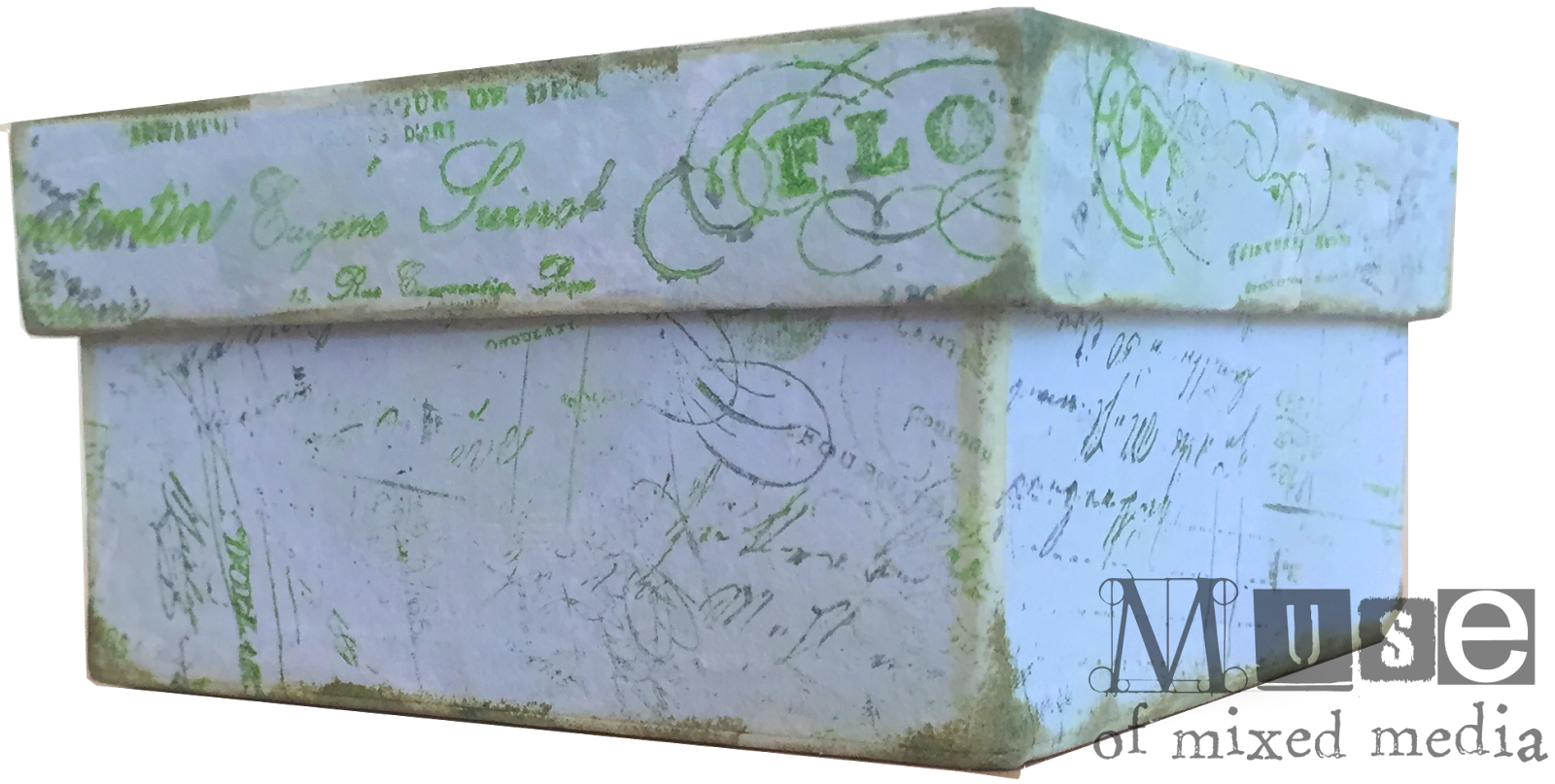
Recently I participated in an altered box swap. More properly, mine was a "decorated" box. Here's how the top looked:
I started with a plain brown inexpensive cardboard box, about four inches square...
...and painted it with several pale colors of acrylic paint (I used Distress paint in Brushed Sage, Tumbled Glass, and Antique Linen).
I then stamped random bits of text on it using a few harmonizing colors of Stazon ink, distressed the edges with chalk inks...
...and lined it with papers from Idea-ology's Wallflower line.
For the box lid, I stamped designs and embossed them with two colors of metallic embossing powder. (I liked the effect of the two colors of embossing powder together. I used Ranger's gold and Liquid Platinum. These are fairly subtle metallics that blended nicely together.)
The finished result:
I hope my swap partner liked it!
I started with a plain brown inexpensive cardboard box, about four inches square...
I then stamped random bits of text on it using a few harmonizing colors of Stazon ink, distressed the edges with chalk inks...
...and lined it with papers from Idea-ology's Wallflower line.
For the box lid, I stamped designs and embossed them with two colors of metallic embossing powder. (I liked the effect of the two colors of embossing powder together. I used Ranger's gold and Liquid Platinum. These are fairly subtle metallics that blended nicely together.)
I hope my swap partner liked it!
Labels:
acrylic paint,
altered art,
box,
embossing powder,
rubber stamps,
stamping,
Tim Holtz
By day I am the principal at Visual Acuity, a graphic recording and visual strategy mapping company...when I have time, I make mixed-media art!
Friday, July 8, 2016
Step-By-Step: A Glasslike ATC
Greetings, fellow Musers! Today I wanted to share with you a fun technique that you can use for making your ATCs a little special. When you cover your card in a couple of coats of melted extra-thick embossing enamel, it is almost like the whole ATC is encased in glass. The effect is hard to photograph, so here I am showing it at a slight angle:
To make this card, I used a simple background of two colors of acrylic paint (I used Distress Paint in Tumbled Glass and Crushed Olive).
I dry-brushed the blue color in one direction across the card...
...and then came back with the yellow-green color in the other direction. You want to keep the brush on the dry side, so that the undercolor and even a bit of the paper show through. This is just a simple background technique that creates a bit of texture and interest while keeping the focus on the foreground.
After the paint dried (you can speed this up with a heat tool if you like), I was ready to stamp my main image. This cool tree reminds me of Yggdrasil for some reason...it is available from Lost Coast Designs here (Misc. Set 3) already sized perfectly for your ATCs. :)
I blended three colors of ink right on the stamp for an interesting look--a green and a gray, with suggestions of black. (And in case you are wondering what those black stripes are on my acrylic block...well, I am old, and those are Velcro, because at one time this was the coolest way to handle a large unmounted rubber collection. This stamp comes cling-foam-mounted though--I just used the back side of the block without the Velcro.)
Here's how the image came out on top of the painted background. The edges that escaped the stamped design will be covered up during the edging phase. :)
Next, I needed a sentiment, so I dug out a lettering stamp set and found that the font I wanted to use happened to exactly fit the word that I wanted to make and the space I wanted to put it in. Cha-ching! Here is the word "growth" laid out in reverse from how the word will print. If you lay the word out from left to right, you will get a surprise when you stamp. Also, it is easy to mix up your b's and d's, so mind your p's and q's.
I stamped the word in black and edged the card in chalk ink.
Now for funsies I wanted to add some sparkle and dimension to be encased under the "glass." On went some glitter-glue dots in gold and green.
TIP: Next, I recommend you mount your image on a stiff piece of chipboard--the sturdier the better, because your card will want to warp after the magical glassy goodness of the next step starts happening, and a heavy piece of board will resist this. If you proceed to the next step with nothing but flimsiness in your project and recklessness in your heart, your "glass" may crack when you try to flatten it out again. Perhaps not the end of the world, but I am here to look out for your best interests and so just thought I'd mention it.
And now the fun part! (I regret exceedingly not having taken any photos of this stage. I think I was too excited. Forgive me.) You take your ATC and press it into the top of an embossing ink pad until the surface of the design is entirely covered with embossing ink. Then you coat the whole front of the card with extra-thick clear embossing enamel, and melt with a heat tool, as one does. But then you repeat the process until you have two or three thick coats of clear resin melted on, and the surface of your card becomes thick, smooth, and glassy.
The result looks like this...although again, that shine and dimension are hard to capture, so here are a couple of angles for you. This first one shows how the glitter-berries catch the light under the "glass"...
The "glass" does add a certain layer of luminosity to the whole card.
Cool, right? And pretty easy. Any questions, please just leave them in the comments below. :) Do let me know if you try this technique and how it turned out for you. 'Cause remember, ATCs are for sharing!
Love,
To make this card, I used a simple background of two colors of acrylic paint (I used Distress Paint in Tumbled Glass and Crushed Olive).
I dry-brushed the blue color in one direction across the card...
...and then came back with the yellow-green color in the other direction. You want to keep the brush on the dry side, so that the undercolor and even a bit of the paper show through. This is just a simple background technique that creates a bit of texture and interest while keeping the focus on the foreground.
After the paint dried (you can speed this up with a heat tool if you like), I was ready to stamp my main image. This cool tree reminds me of Yggdrasil for some reason...it is available from Lost Coast Designs here (Misc. Set 3) already sized perfectly for your ATCs. :)
I blended three colors of ink right on the stamp for an interesting look--a green and a gray, with suggestions of black. (And in case you are wondering what those black stripes are on my acrylic block...well, I am old, and those are Velcro, because at one time this was the coolest way to handle a large unmounted rubber collection. This stamp comes cling-foam-mounted though--I just used the back side of the block without the Velcro.)
Here's how the image came out on top of the painted background. The edges that escaped the stamped design will be covered up during the edging phase. :)
Next, I needed a sentiment, so I dug out a lettering stamp set and found that the font I wanted to use happened to exactly fit the word that I wanted to make and the space I wanted to put it in. Cha-ching! Here is the word "growth" laid out in reverse from how the word will print. If you lay the word out from left to right, you will get a surprise when you stamp. Also, it is easy to mix up your b's and d's, so mind your p's and q's.
I stamped the word in black and edged the card in chalk ink.
Now for funsies I wanted to add some sparkle and dimension to be encased under the "glass." On went some glitter-glue dots in gold and green.
TIP: Next, I recommend you mount your image on a stiff piece of chipboard--the sturdier the better, because your card will want to warp after the magical glassy goodness of the next step starts happening, and a heavy piece of board will resist this. If you proceed to the next step with nothing but flimsiness in your project and recklessness in your heart, your "glass" may crack when you try to flatten it out again. Perhaps not the end of the world, but I am here to look out for your best interests and so just thought I'd mention it.
And now the fun part! (I regret exceedingly not having taken any photos of this stage. I think I was too excited. Forgive me.) You take your ATC and press it into the top of an embossing ink pad until the surface of the design is entirely covered with embossing ink. Then you coat the whole front of the card with extra-thick clear embossing enamel, and melt with a heat tool, as one does. But then you repeat the process until you have two or three thick coats of clear resin melted on, and the surface of your card becomes thick, smooth, and glassy.
The result looks like this...although again, that shine and dimension are hard to capture, so here are a couple of angles for you. This first one shows how the glitter-berries catch the light under the "glass"...
The "glass" does add a certain layer of luminosity to the whole card.
Cool, right? And pretty easy. Any questions, please just leave them in the comments below. :) Do let me know if you try this technique and how it turned out for you. 'Cause remember, ATCs are for sharing!
Love,
Labels:
acrylic paint,
ATC,
ATCs,
dry brush,
embossing powder,
glass,
glasslike,
glitter,
rubber stamps,
stamping,
step by step,
Stickles,
tutorial
By day I am the principal at Visual Acuity, a graphic recording and visual strategy mapping company...when I have time, I make mixed-media art!
Subscribe to:
Posts (Atom)


