Hiya stampies!
There's another fun contest running over at the Lost Coast Portal to Creativity, this time on the theme of "Steampunk Queen of Hearts"! Just enter your themed art using rubber stamps by midnight on February 24 for your chance to win blog badges and gift certificates for free rubber at the incredible Lost Coast Designs, purveyors of some of the quirkiest and most interesting images around.
Here's my project to get you going. It features Lost Coast Designs' gears background stamp behind the action, with the Queen giving orders to Steampunk Icarus to chase down the Steampunk Balloon Guys who are getting away!
I'll be back in a few days with a step-by-step of how this piece was made, including a tip on how I got the cool 3D effect on the gears in the center of the piece. Check back!
Can't wait to see what you come up with for your own Steampunk Queen of Hearts. Click here for all the contest details and get stampin'!
Looking for something? Search this blog:
Showing posts with label Perfect Pearls. Show all posts
Tuesday, February 14, 2017
New Stamp Art Challenge: Steampunk Queen of Hearts
Labels:
challenge,
challenges,
collage,
contest,
contests,
distress,
distress ink,
Lost Coast Designs,
metallic watercolor,
Perfect Pearls,
stamping,
steampunk rubber stamps
By day I am the principal at Visual Acuity, a graphic recording and visual strategy mapping company...when I have time, I make mixed-media art!
Saturday, January 14, 2017
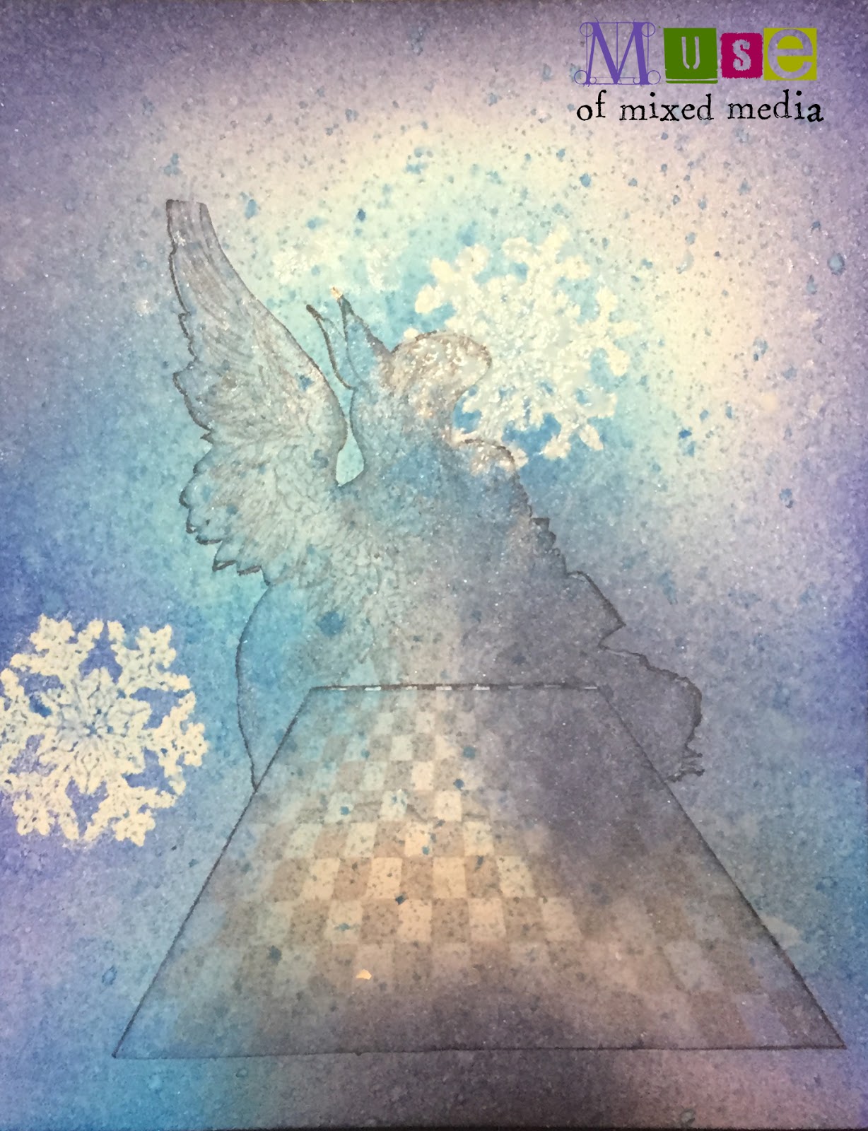
'It's Snowing,' Said the Gryphon: Alice In Winterland
It's Alice in Winterland over at the Lost Coast Portal to Creativity! What is that, you ask? It's an art challenge where you enter a piece that uses at least one rubber stamp (from any company) in order to be entered to win a gift certificate for MOAR RUBBER from the fabulous Lost Coast Designs! More details about the challenge are here.
To offer a little visual inspiration on the theme of Alice being in Winterland, I have here this little fantasy project for you:
First I stamped the "Alice and Gryphon" image from the Alice, Dodo, and Griffen set from Lost Coast Designs, then masked it off and stamped the Chessboard from the Chess Set under it. Then I made a mask for the chessboard and added it to the card.
Next I took some snowflakes from the Small Snowflake Set and stamped them in resist ink, which I dried with a heat gun. Then I broke out the Distress inks and chose three shades of blue to start working into the card with a mini ink blending tool. Below you can see the first snowflake start to emerge from the "sky"...
...And here I'm adding the second shade of blue to bring out the next snowflake from the resist. You see that I am inking right on top of the masks I made to cover the central images.
At this point, with the masks still on, I broke out some ink sprays and added blue and silver shimmer to the card. Alas, the shimmer really does not photograph, but it gave a nice frosty look to the piece in real life. I left a little "halo" of uncolored paper around one of the snowflakes for a bit of light effect.
With white and silver gel pens, I added some background dots and tiny snowflakes. I also stamped a few more snowflakes with the Snowflake Set and embossed them with glittery white embossing powder. (The glitter doesn't show up very well here either...you can see it mostly on the snowflake at the lower right.) Then I was ready to remove the masks to let the figures stand out from the wintry background...
Here is the piece with the masks removed, photographed at another angle, attempting to show more of the glitter and shimmer:
Lastly, in InDesign I composed a sentiment (taken very nearly as a quote from Alice in Wonderland!) and inserted it into a frame. I printed this out and mounted the art atop it. Et voila!
Can't wait to see what you make for the Alice in Winterland challenge! You have until midnight on January 31 to enter. :)
Labels:
challenge,
challenges,
contest,
contests,
distress,
distress ink,
gel pens,
glitter,
Lost Coast Designs,
masking,
Perfect Pearls,
resist,
rubber stamps,
shimmer,
stamping,
step by step
By day I am the principal at Visual Acuity, a graphic recording and visual strategy mapping company...when I have time, I make mixed-media art!
Thursday, September 8, 2016
Retro Art Tag with Translucent Mixed-Media Layers
My darlings! I have another tag for you this week, featuring more stamps from my beloved going-out-of-business Stampsmith. Once the remaining stock on Etsy is gone, there will be no more of these fabulous quirky vintage/retro images! ;-( Git you some while the gittin's good! For cheaps, too!
Behold the tag:
For this tag, I stamped her with brown and black Stazon ink (mixed right on the stamp) onto some glossy photo paper. Then I masked Maxine and stamped this fab image ("Bed of Roses") around her:
Once the tag was dry, I stamped some rose images from another company (Deep Red Stamps) in maroon chalk ink in various intensities. This amplified the layered, dimensional effect, making some of the stamp prints look as though they were showing through layers of color.
Lastly, I printed out my quote in a vintage-inspired font with an insouciant personality to match Maxine's, and sketch-outlined the words in two shades of red Distress marker before cutting and collaging down onto the tag.
I topped the tag off with some whitish satiny ribbon, and saucy Maxine was good to go.
As always, I welcome your comments below. (Oh, wait--[tap tap]--was this thing even on???)
Behold the tag:
Here's what was done. I made a mixed-media background for the tag that has a great layered, translucent quality. On top I collaged a print of two stamps:
Meet Maxine. She is one of The Stampsmith's famed photostamps, and her expressive face and hands mean that she can serve as a wonderful spokesmodel for anything you want her to say. :)
For this tag, I stamped her with brown and black Stazon ink (mixed right on the stamp) onto some glossy photo paper. Then I masked Maxine and stamped this fab image ("Bed of Roses") around her:
I painted the roses with Distress Inks dabbed onto a craft sheet (Candied Apple, Barn Door, Aged Mahogany) and gave Maxine a halo of Abandoned Coral, then set the image aside to do the tag background.
Now on my craft sheet I swirled Distress Paint in the same hues of red, plus metallic gold and bronze, spritzed my tag and the paint with water, and dragged the tag into the paint. After drying with a heat tool, I rubbed some more Distress Ink over the whole surface with a mini ink tool and misted it with shimmer spray to let that layer of color bleed together and flow down the tag. I sprinkled on some Perfect Pearls powder in gold for good measure while it was wet, and let the tag dry.
(Tim Holtz has a tutorial on essentially this technique here. He uses colors designed to mimic the patina of copper, whereas I kept mine in close tones for a subtle, glowing look, but it's a great technique that gives richness and depth no matter what colors you choose.)
Once the tag was dry, I stamped some rose images from another company (Deep Red Stamps) in maroon chalk ink in various intensities. This amplified the layered, dimensional effect, making some of the stamp prints look as though they were showing through layers of color.
Here is another photograph in different lighting, so you can see more of the translucence and metallic shimmer:
Now it was time to put it all together. I edged Maxine and the tag in chalk ink. And here are the two parts of the piece before assembly. :)
Lastly, I printed out my quote in a vintage-inspired font with an insouciant personality to match Maxine's, and sketch-outlined the words in two shades of red Distress marker before cutting and collaging down onto the tag.
I topped the tag off with some whitish satiny ribbon, and saucy Maxine was good to go.
As always, I welcome your comments below. (Oh, wait--[tap tap]--was this thing even on???)
Labels:
acrylic paint,
art tag,
chalk ink,
distress ink,
Perfect Pearls,
retro,
rubber stamps,
shimmer,
stamping,
Stampsmith,
tag,
Tim Holtz,
vintage
By day I am the principal at Visual Acuity, a graphic recording and visual strategy mapping company...when I have time, I make mixed-media art!
Tuesday, September 6, 2016
Step-By-Step: Vintage Mixed-Media Tag ("Sweet Mabel")
Hi guys! Today I have a step-by-step breakdown of how I made this vintage mixed-media tag.
I call it "Sweet Mabel." Mabel was the name of the mother of my childhood friend Maryellen, and it struck me as an old-fashioned name even back then. The Mabel I knew was pretty nice, although she looks nothing like the "Mabel" on this tag. :)
I started with a journaling card that looked like this:
The text on the card didn't really bother me, as I knew I'd be covering most of it up during the making of the tag anyway. So I trimmed the card to tag size and shape and got to work...
I took out a mini ink tool and a couple of colors of Distress ink and went over the lettering to reduce the difference in value between it and the background:
Next, I chose some vintage sheet music and a page from a midcentury book and tore them up, then added a piece of scrapbook paper, and collaged it all down with Mod Podge. At this stage, things looked like this:
This was a good start, but the tag needed some texture and dimension. So I got out my trusty texture paste and a favorite stencil, and quickly slapped some scrolly leaves onto a few spots on the tag.
After letting the paste dry for a couple of minutes, I wanted to blend and distress the whole shebang so it would start to merge into a unified background. I got out some spray stains in Tea Dye and Antique Linen and spritzed a bit...
But the tag still needed MOAR. I dabbed some Distress Stain in Crushed Olive (one of the most awesome colors ever to exist, by the way; you can thank me later) and let the tag start to marinate in all the vintage-colored juices I was bathing it in.
And yet even the divine Crushed Olive was not really doing enough. I wanted the scrolly leaves and vines to stand out a bit more, and I also wished I hadn't slapped the texture paste on so roughly; I wanted it a little smoother. So I decided to blend a custom glaze of Mod Podge (you could use any gel medium) and Distress Stain. I mixed a little Vintage Photo into my medium and painted over the vines.
I glued Mabel behind the frame and fastened it down with some brads, adding a special rhinestone brad at the top of the frame.
The frame was decorated with some peach-pink roses that I fussy-cut from a few odd pieces of paper I had lying around.
And suddenly, all that was left to finish the tag was to punch a hole at the top...edge the tag in copper metallic and brown chalk ink...add a piece of distressed trim to the bottom edge...and tie it with a ribbon.
Et voila! Sweet Mabel lives on in her own tag. As always, I welcome your comments and thoughts below, and am happy to answer any questions if I skipped over something you might have wanted to know more about. :)
Happy art-making!
I call it "Sweet Mabel." Mabel was the name of the mother of my childhood friend Maryellen, and it struck me as an old-fashioned name even back then. The Mabel I knew was pretty nice, although she looks nothing like the "Mabel" on this tag. :)
I started with a journaling card that looked like this:
The text on the card didn't really bother me, as I knew I'd be covering most of it up during the making of the tag anyway. So I trimmed the card to tag size and shape and got to work...
I took out a mini ink tool and a couple of colors of Distress ink and went over the lettering to reduce the difference in value between it and the background:
Next, I chose some vintage sheet music and a page from a midcentury book and tore them up, then added a piece of scrapbook paper, and collaged it all down with Mod Podge. At this stage, things looked like this:
This was a good start, but the tag needed some texture and dimension. So I got out my trusty texture paste and a favorite stencil, and quickly slapped some scrolly leaves onto a few spots on the tag.
After letting the paste dry for a couple of minutes, I wanted to blend and distress the whole shebang so it would start to merge into a unified background. I got out some spray stains in Tea Dye and Antique Linen and spritzed a bit...
But the tag still needed MOAR. I dabbed some Distress Stain in Crushed Olive (one of the most awesome colors ever to exist, by the way; you can thank me later) and let the tag start to marinate in all the vintage-colored juices I was bathing it in.
And yet even the divine Crushed Olive was not really doing enough. I wanted the scrolly leaves and vines to stand out a bit more, and I also wished I hadn't slapped the texture paste on so roughly; I wanted it a little smoother. So I decided to blend a custom glaze of Mod Podge (you could use any gel medium) and Distress Stain. I mixed a little Vintage Photo into my medium and painted over the vines.
The glaze pooled a little bit around the texture paste and smoothed everything out a little, helping the vines pop just enough.
Now it was time to put the focal point together. I had a vintage photo of "Mabel" all ready to go; it didn't need anything done to it. But it needed a frame to set her off. I chose a die-cut frame made of scrapbook paper rather than an actual metal frame. But it needed more dimension...so I coated it with clear embossing powder dusted with Perfect Pearls in Heirloom Gold to add just a hint of aged patina, then melted the mixture to the frame.
I glued Mabel behind the frame and fastened it down with some brads, adding a special rhinestone brad at the top of the frame.
The frame was decorated with some peach-pink roses that I fussy-cut from a few odd pieces of paper I had lying around.
And suddenly, all that was left to finish the tag was to punch a hole at the top...edge the tag in copper metallic and brown chalk ink...add a piece of distressed trim to the bottom edge...and tie it with a ribbon.
Et voila! Sweet Mabel lives on in her own tag. As always, I welcome your comments and thoughts below, and am happy to answer any questions if I skipped over something you might have wanted to know more about. :)
Happy art-making!
Labels:
art tag,
chalk ink,
collage,
creative process,
distress,
distress ink,
embossing powder,
Perfect Pearls,
powdered pigment,
step by step,
tag,
texture paste,
vintage
By day I am the principal at Visual Acuity, a graphic recording and visual strategy mapping company...when I have time, I make mixed-media art!
Subscribe to:
Posts (Atom)